Project Highlight: Moody Master Bedroom
I love to highlight some of our favorite projects! We often get so many questions about how we came up with a design, how we selected a color scheme, or what products were used. I’m sharing some details about this particular client project where we created a sexy, moody master bedroom. If you’re afraid of the dark, you won’t be after this…you’ll embrace it. Are you ready?
THE PAIN POINT
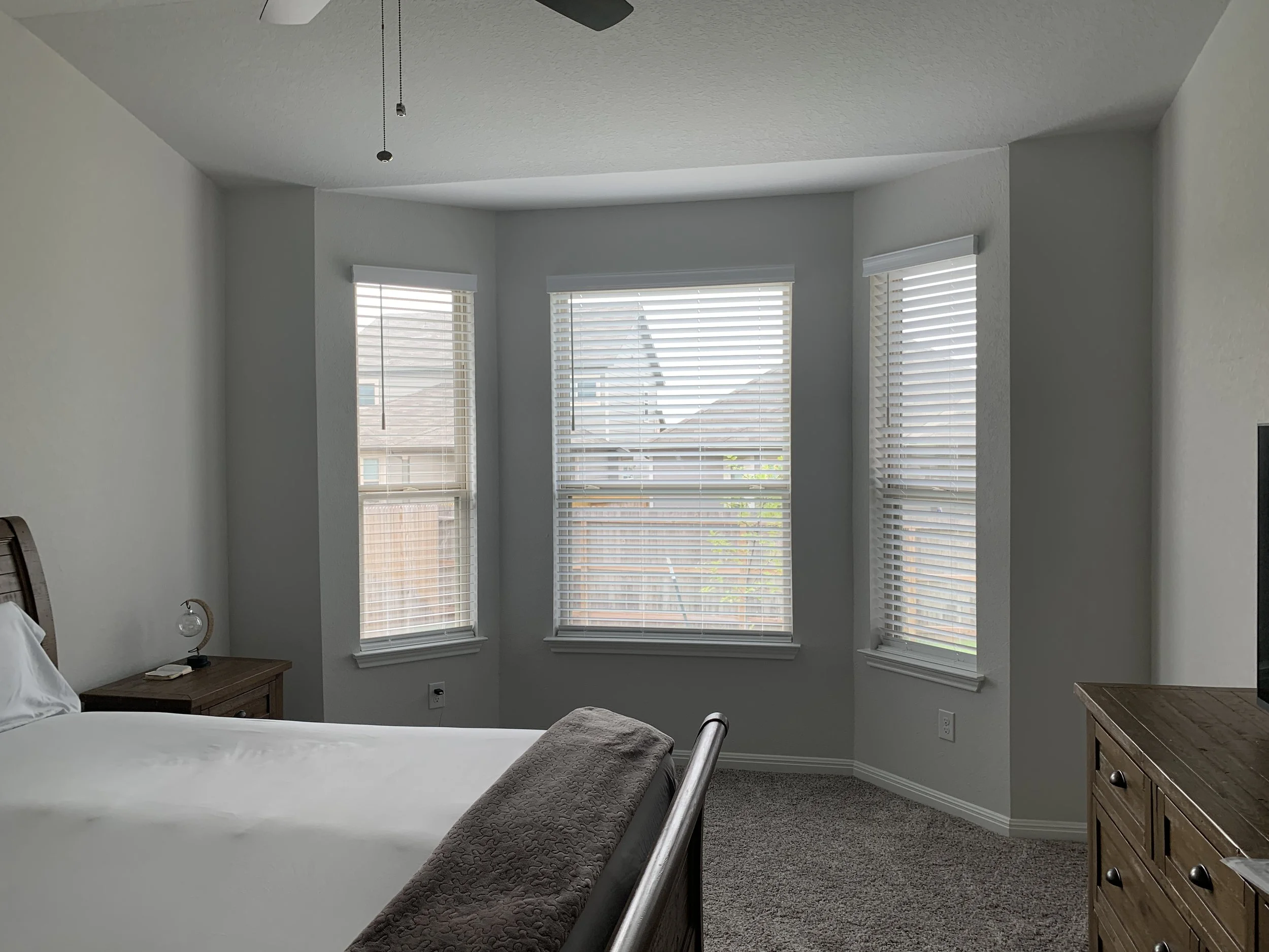
Our client Nicole reached out to us because she was so tired of failed decorating attempts in her very first home. She had been in the U.S. Navy for a few years at this point and this was the first time she had ever purchased a home. It was a beautiful newly constructed home! Although brand new, it was very lackluster with no personality.
We ended up designing her living room space and she absolutely loved it! In fact, she cried when we revealed the new space to her (we’ll tell you all about that project in another blog post). Awww, I’m trying not to cry now as I’m thinking back to that moment. Sniffle. Sniffle
Shortly after we finished the living room, it was time to elevate her boring and plain bedroom. Nicole had the same bedroom furniture for years, brown, rustic in style, and quite bulky for the space. She expressed how much she didn’t like it and wanted new furniture and a whole new look. The task: give her a sexy, glam 5-star hotel feel in that space. She wanted it to be cozy, inviting, and very luxurious. Challenge accepted! This was right up our alley.
Initial design concept option
Initial design concept option
DESIGN DEVELOPMENT
I was inspired by very high end, luxury boutique hotels for Nicole’s bedroom design. Remembering some of the hotels I’ve stayed in over the years, it wasn’t difficult to take some ideas from those experiences and marry them to her wish list.
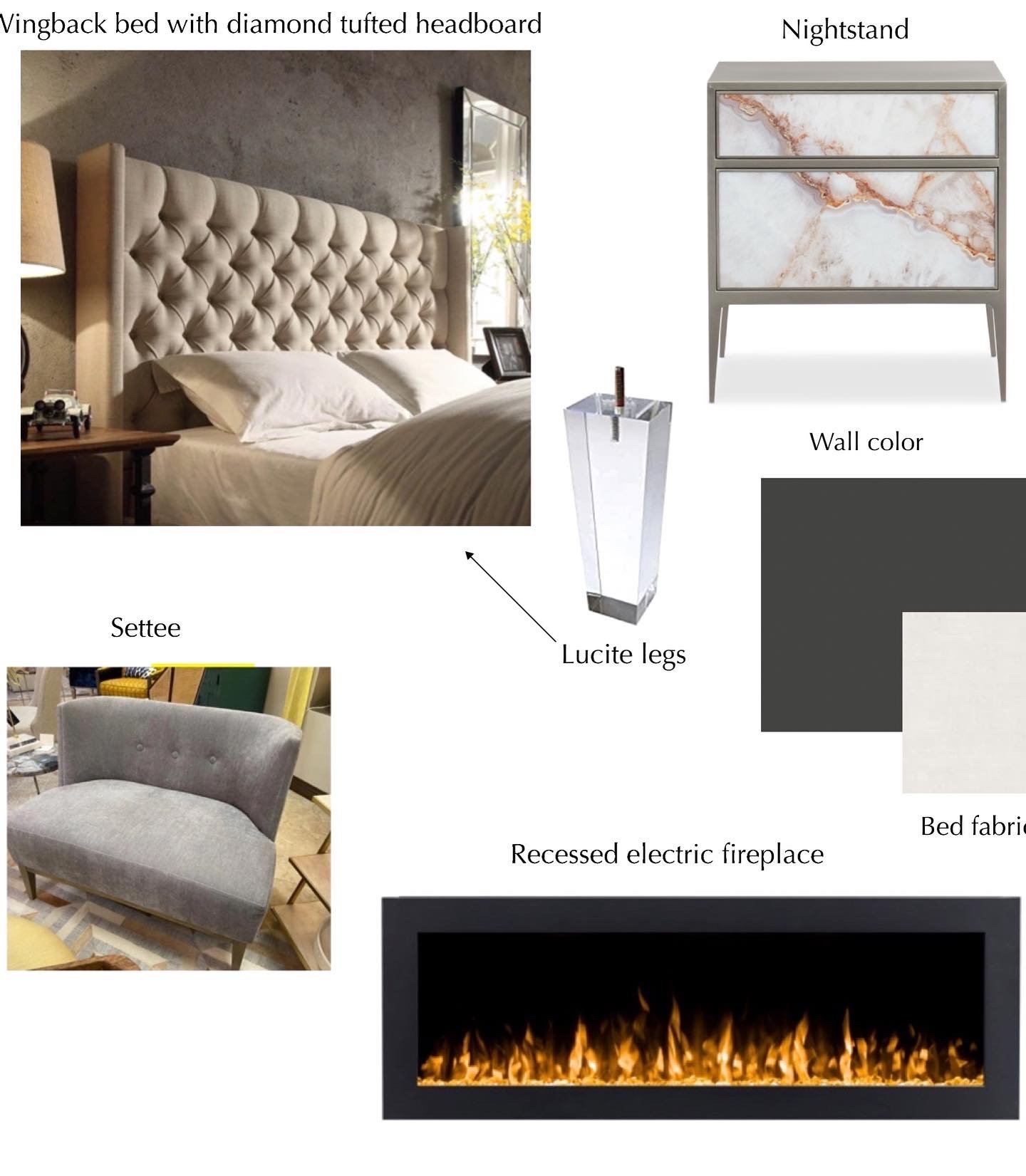
After several client interviews, her design questionnaire responses, and constant collaboration, I created two mood boards each with a different style to see which one she was more drawn to. One mood board had a similar feel to her living room in terms of color and aesthetic. The other one boasted deep, rich colors with a more elegant, luxe feel. I was absolutely shocked when she said she really loved the moody concept. But at the same time, super excited that she was open to stepping out of her comfort zone an allowing us lots of creative freedom!
CHALLENGES
Most people think that design projects don’t run into any problems or challenges just because the “after” photos look magazine-worthy. You see the end result of a project, but rarely get true insight on what problems the designer had to contend with. HGTV has ruined us all. Often times, designers don’t want people to know there were issues for fear it will make them seem like they didn’t know what they were doing. But know this…there is no perfect project!
Designers are human. We make mistakes. The question is, how do we respond? We are problem-solvers and that’s why our clients hire us. They don’t have time to figure things out, or deal with contractors.
The one issue we had during this particular project was the electric fireplace installation. The plan was to install it into the client’s bedroom wall. We knew that there wasn’t anything inside the wall that would hinder the placement of the unit (i.e. plumbing, concrete, etc.). We also knew the depth of the fireplace unit but did not confirm the depth of the interior wall since the fireplace manufacturer assured us it would fit. When the drywall was cut out, it appeared that there was enough room; however, when the electrician inserted the unit into the wall, we discovered that were “short” by about an inch in order for the fireplace to be flush with the wall. Tartar sauce!
The electrician was able to make some tweaks within the wall to allow for the unit to slide in about another half inch or so, but it still wasn’t flush like I wanted. Even though this part of the process sucked and I was mad at myself for not verifying the measurements despite the manufacturer’s assurance. What I’ve learned is that the beauty of running into challenges is the ability to develop some creative solutions!
I’m so blessed to have the team of amazing trades I work with because every project requires a team. I could not do this all on my own. I need their brain power just as much as they need mine (although I may need theirs just a bit more sometimes). As a team, our solution was to create a bump-out that would essentially “frame” the fireplace unit. So even though it wouldn’t be flush with the wall as I originally planned, it would still have a modern, clean aesthetic we were going for but with more of a customized element to it.
I had our drywall guy visit the project site and build out the frame around the fireplace in the wall, then add sheetrock and texture to it. Once all of that was accomplished, we painted it the same color of the wall and wa-la! It all worked out and I actually like the look better now because it’s adds some depth and interest to an otherwise flat wall.
FINAL RESULT
In addition to adding a fireplace to her bedroom space, we decided to black out the room to include the ceiling, doors, and trim. Since black is such a bold color, we didn’t select a true black but we went with Benjamin Moore’s Wrought Iron (more of a soft black) in a matte finish for the ceiling and walls. We used a semi-high gloss for the doors and trim. Note to self — don’t be afraid of using dark colors! It can completely change the feel of the space! Color is powerful.
Black wood accent panels were perfectly cut and applied to a portion of the wall near the fireplace, but far enough that it’s away from the heat as a safety requirement. This was done to add more depth, interest, and texture to the space.
Moody master bedroom
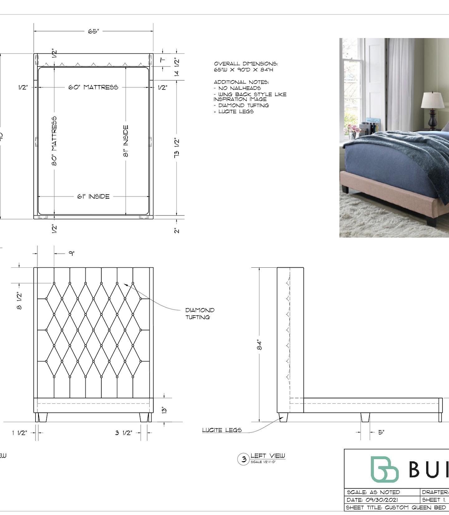
Of course the bed is the focal point of the room. We collaborated with BuildLane to design a custom bed we designed that boasts a seven foot tall tufted wingback headboard, white textured performance velvet fabric, and Lucite legs. Our full service clients get access to vendors who only work with the Trade and BuildLane is one of them. We decided to keep the clean, white theme for bedding to add contrast and light in a dark space. Textured custom throw pillows in blush and gold were added for pops of subtle color.
The nightstands are black with Lucite drawer pulls and brass accents. Black cluster LED pendants were hung directly above them with large brass framed mirrors placed on the wall behind the nightstands to allow for beautiful reflection of the lights when their turned on. The mirrors are also a great way to make the room look larger and bounce a lot of natural light around when window coverings are open. A custom crystal chandelier was installed on the ceiling for that extra glam, high-end feel.
We wanted a layered look for the window coverings, so we did custom Roman shades in white with soft, linen blend drapery panels. We worked with our local interior design showroom (only open to the Trade) for the custom Lucite drapery hardware with brass accents to tie beautifully with the nightstands and bed legs.
Accent pieces include a beautiful gray velvet settee with custom pillows near the bay windows and abstract artwork hung on the wall.
Moody master bedroom
So as you can see, the final result is stunning! Our client Nicole absolutely loves it and she says that it’s so hard for her to get out of bed to go to work each morning now. She spends more time in her beautiful bedroom and continues to get compliments from people who visit her home.
I hope you found our project details helpful. We all get used to seeing the beautiful final photos of a design project and swoon, but we rarely get a peek inside the ugly stuff that happened! I had so much fun on this project and extremely happy with how everything turned out. This should give you full confidence about using dark colors in your space! You can check out more photos of this project in our Portfolio.
Don’t hesitate to reach out to us for your next design project. Fill out our Contact Form today so we can chat about how we can help elevate your living space.


